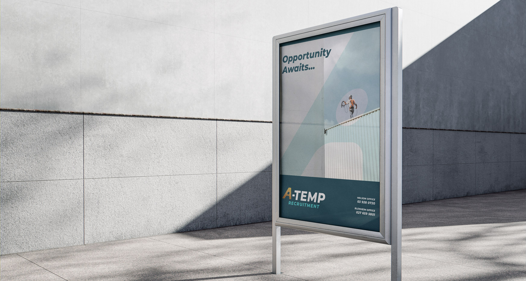
A-TEMP RECRUITMENT – REBRAND
BACKGROUND: A-Temp is a recruitment agency that requested new branding to reflect their growth from a labour-force focus to a wider-reaching market.
SOLUTION: We developed a modern and person-centric visual identity with a more premium feel to attract a new audience and higher revenues.
The new logo features an illustrative "A" symbolising light streaming through an open doorway, unveiling a person. This imagery signifies the path to new opportunities, emphasising the agency's role in connecting individuals with promising prospects.
Client: A-Temp Recruitment
Project: Rebranding – logo, business cards, letterhead
Creative Director: James Sullivan

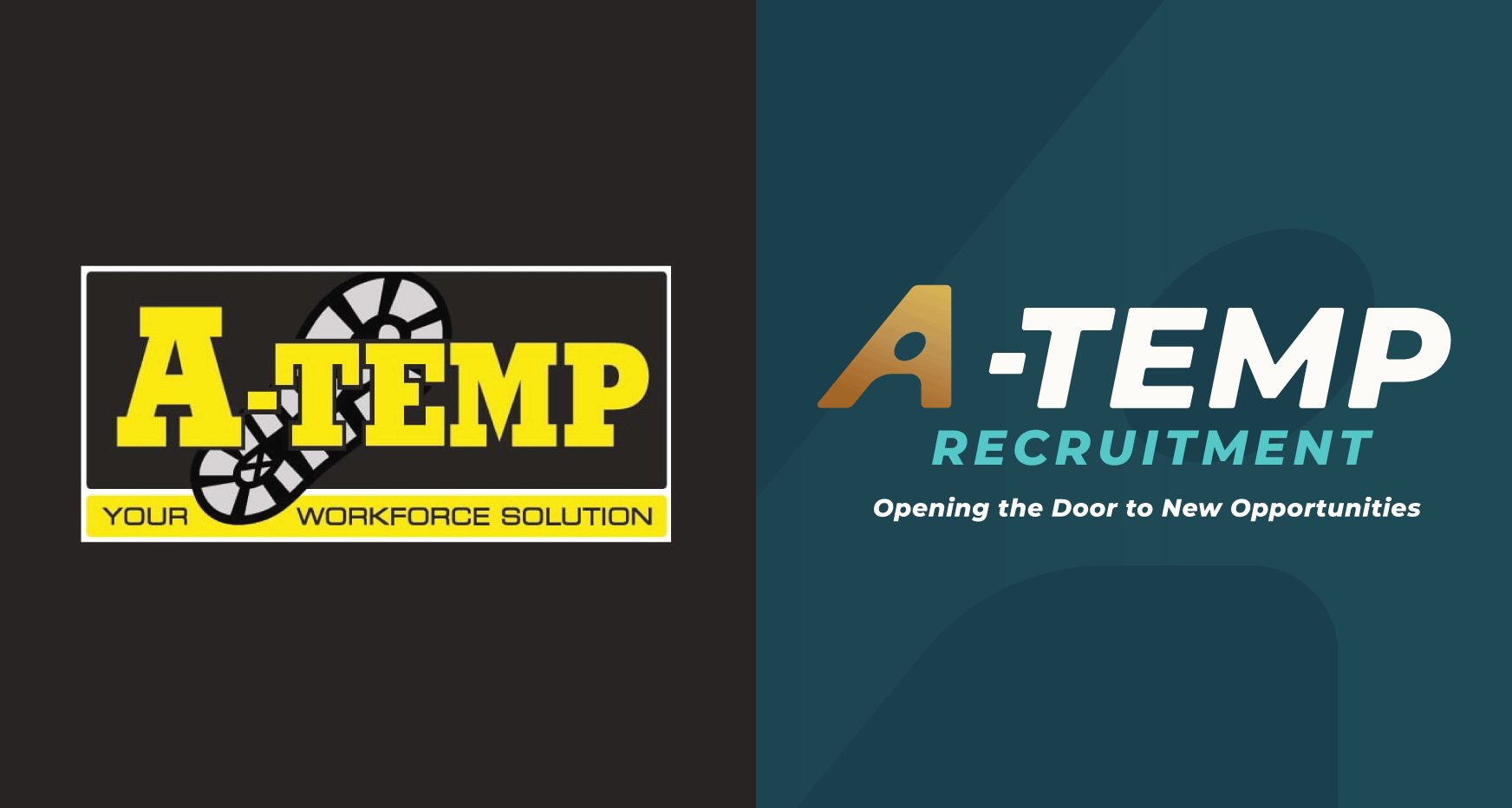
old & new logos // A-Temp Recruitment
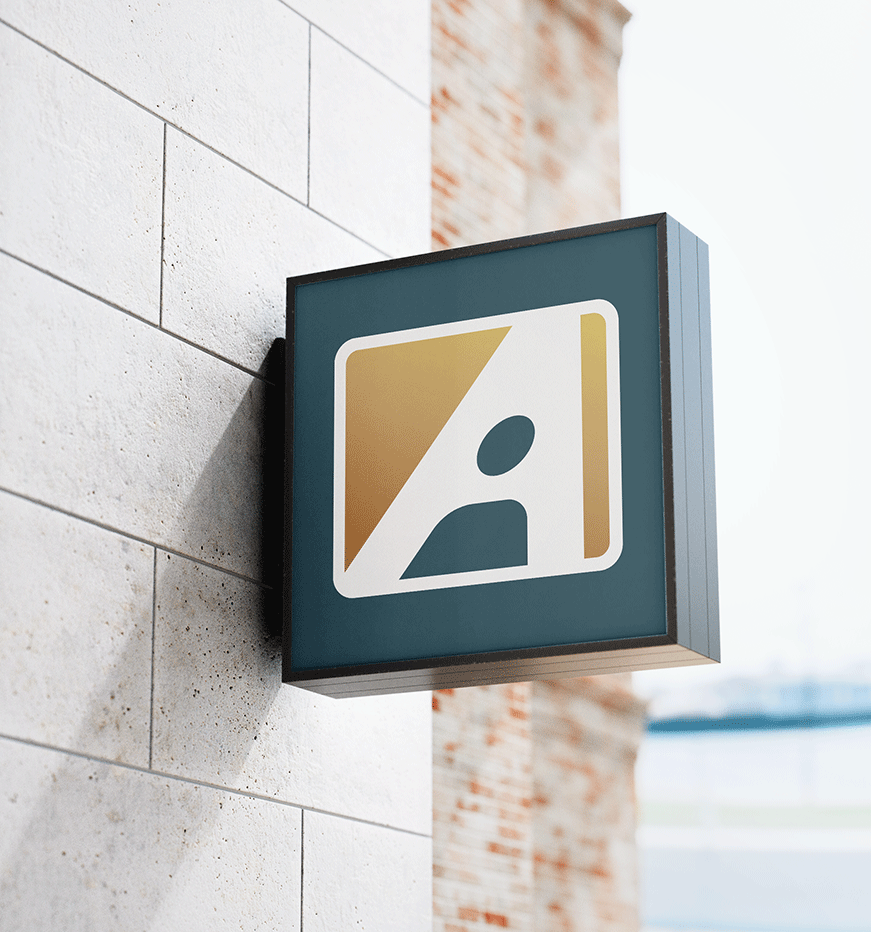
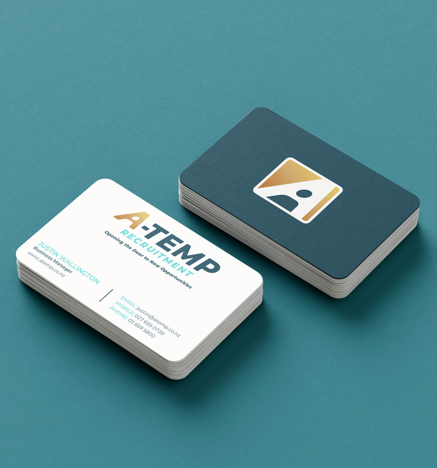
signage design // business card design
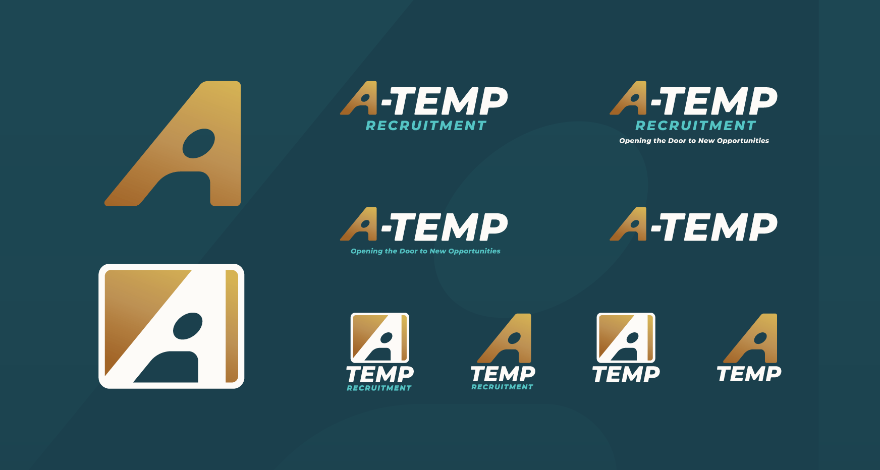
icon & logo suite design
WHAT THEY SAID:
"Rebranding can be daunting, but Black Dog's process and skill soon put us at ease. Their intake session allowed us to define our goals and explore multiple routes before we developed the final design, which we love. There's so much scope to play with the figure within the 'A' for creative advertising projects. Highly recommend!"
- JUSTIN WALLINGTON, A-Temp

advertising & poster design // vehicle signage & wrap design

