CLAYCUTTERS BASEBALL – BRANDING
BACKGROUND: The Claycutters Baseball Team needed new branding to reflect their Cornish roots and attract potential sponsors.
SOLUTION: We developed a suite of bold logos, incorporating rich Cornish symbolism, to create a strong, recognisable brand with standout merchandise.
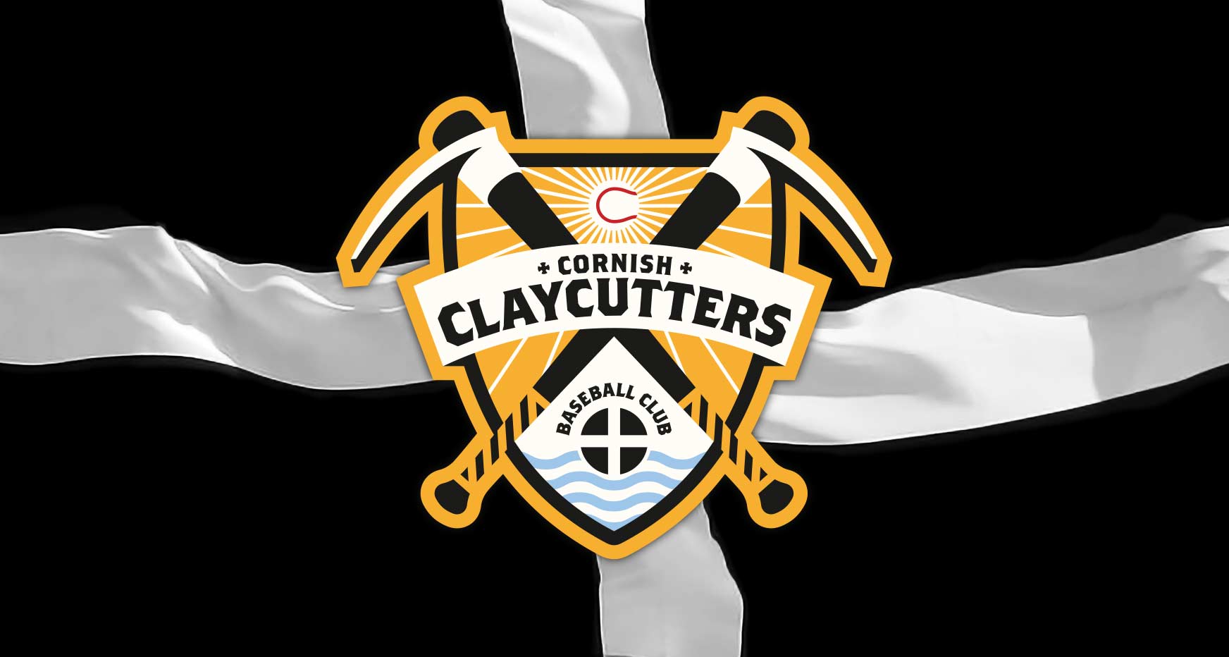
The design features a combination of two clay cutting picks, known as 'grubbers', intertwined with baseball bats. The white clay pyramids of St Austell form the base of the design, while the Cornish Coat of Arms influences the overall colour palette.
Client: Cornish Claycutters Baseball Club
Project: Brand and merchandise design
Creative Director: James Sullivan

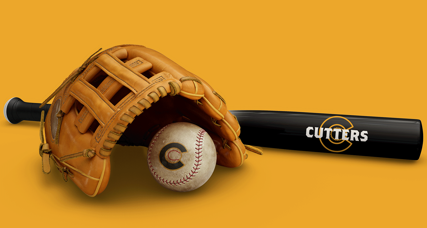
baseball bat and ball design // baseball glove design
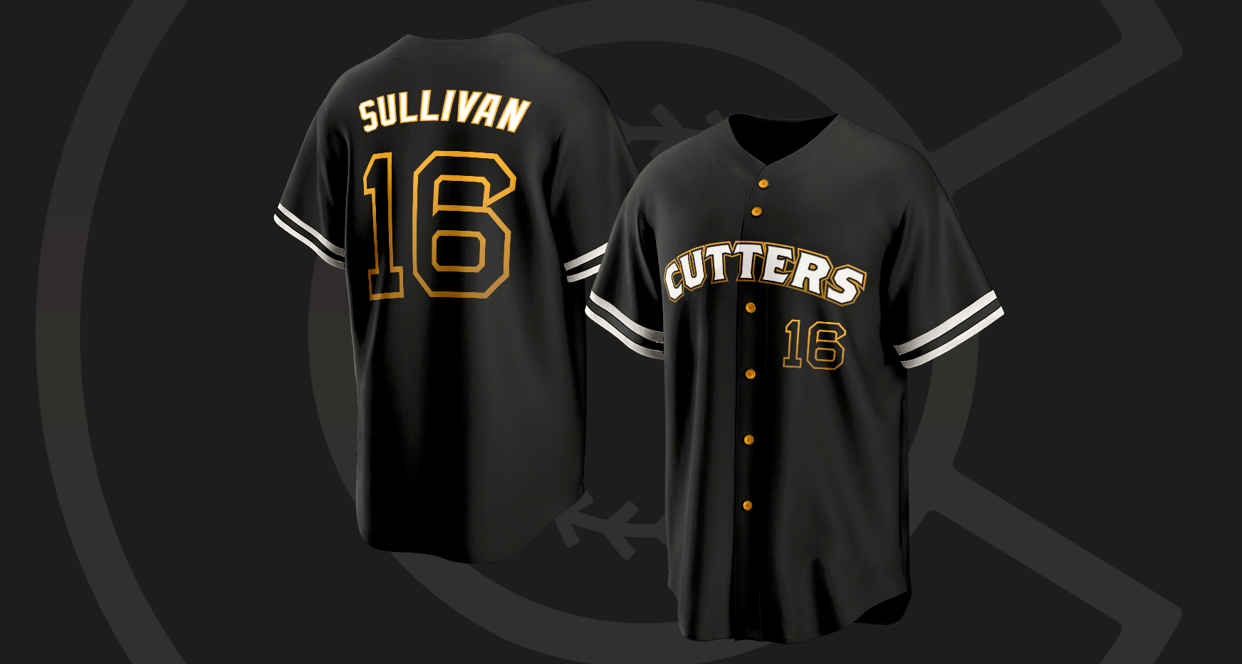
baseball uniform design // baseball shirt design
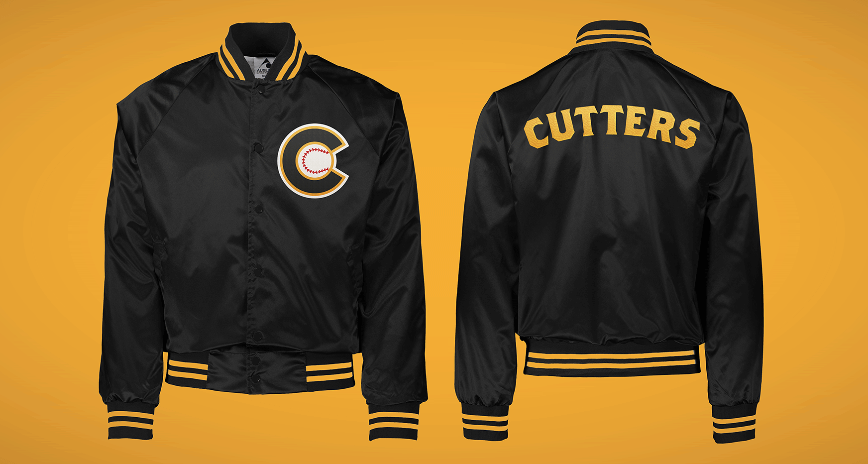
baseball merchandise design // baseball jacket design
WHAT THEY SAID:
"Baseball is a hard sell in the UK and you've got to stand out. Strong branding and eye-catching design are a must-have for a niche sport like UK Baseball. While it grows and we grow with it, we're proud to be at the forefront of style with the work James did for us.
Black and gold is a classic combo, but it's never looked this good! Our team's image was massively enhanced by our partnership with James, and now we look as good off the diamond as we do on it."
- STRAHAN WEIR - Team Manager
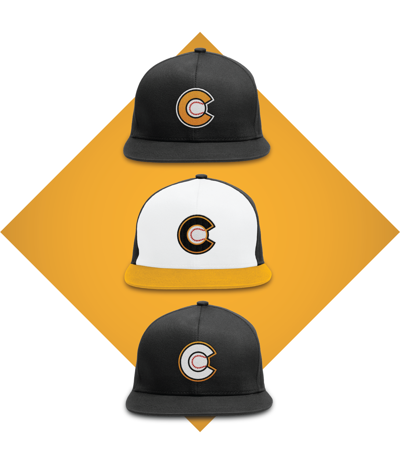
baseball cap design // 3 variations in team colours
